Dee Schlotter , PPG Architectural Coatings05.15.15
Where do color trends come from? It’s a common question among designers, architects and paint and coatings professionals who are challenged with making color decisions nearly every day.
The answer is quite simple: everywhere.
Inspiration for color trends can come from a combination of elements found in nature, technology, fashion, media, consumer preferences and more. Color selections are also strongly impacted by the current – and projected – global economic climate.
Often, an even more prominent question among professionals is: How do color trends impact my business goals?
The answer to this question has several facets to consider.
Color provides avenues for individual expression and creativity, while also being a profound business vehicle. Color psychology, or the meaning and feeling associated with a specific color, is proven to have a significant impact on consumer purchase decisions. In fact, research from The Journal of Genetic Psychology has shown that color is such a powerful marketing tool that it accounts for 85 percent of the reason someone decides to purchase a product.
Armed with the right information, tools and technology on the latest color trends, coatings professionals can more easily educate customers and direct them to the paint selections that fit their tastes – ultimately to help increase sales and overall customer satisfaction.
Think Outside the Paint Can
Recognizing that color has strong emotional and cultural connections — as well as varying uses — it is important to consider multiple factors when researching and identifying a global color palette. For the color forecasters at PPG, there is a true artistic process to setting the tone for its annual color trends.
Each year, a network of 23 international color experts organize a three-day Global Color Meeting to analyze design trends, consumer preferences and priorities across regional, cultural and global markets to determine factors that will influence future color choices. Color styles from multiple industries are considered, including automotive, architectural, aerospace and consumer products markets.
Day One consists of group sharing where each expert presents twelve months of preparation, mood boards, magazine cutouts and Pinterest boards for inspiration. Their color ideas are all based heavily on cultural and demographic trends from their region and markets.
Day Two involves identification of common themes across all markets and influences. Color themes chosen are also reflective of cultural changes and sociological shifts that have a global impact.
Day Three is reserved for final color trend selection and refinement. The color stylists collaborate to define the overarching idea behind each color trend palette, but nothing is more hotly debated than the Color of the Year.
2015 Color Trends and Applications
Four global color trends from PPG encompass a wide array of palettes and moods for 2015. Moreover, these color trends aren’t limited just to the home because the hues that consumers love aren’t limited only to the home either — color surrounds every facet of their daily lives.
The following four color trends are part of THE VOICE OF COLOR Program, an industry-leading color system with innovative tools and comprehensive support. It’s a design system based on the premise that every color has an emotional association and that individuals are drawn to different colors for reasons inherently tied to their unique personalities. The program is the color platform for the PPG PAINTS, PPG PITTSBURGH PAINTS and PPG PORTER PAINTS brands.
Trend 1: Good Life
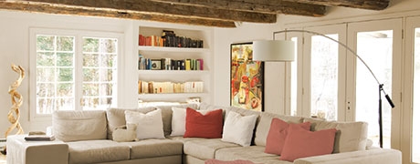
A theme that puts the simplicity of living, harmony and nature at the forefront. Good Life uncovers the maximum possible harmony between the man-made and the natural environment. By emphasizing an earthen spirit and a respect for simplicity, these consumers are often drawn to items that are suggestive of “roughing it.” Good Life is abundant in materials that have a natural quality and rough look, like reclaimed wood, gently pummeled leather and braided wicker. The color palette includes earthy naturals, like soil- and rust-colored browns, quiet whites and softened, clay-colored pinks. The trend comes to life in exterior woodwork and metals with rusted finishes, and interior design styles that favor hand-crafted looks.
Trend 2: I’m Pulse
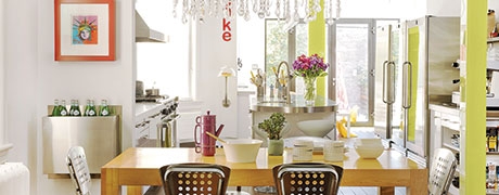
A theme that fits a social, gregarious consumer group happy to play creative director of their total life experience. I’m Pulse emphasizes the individual consumer who is taking control of design output through the digital space to create what they want, when they want it and how they want it. The personality is plugged in, social and connected and has grown up with a spirit of teamwork and togetherness. The color palette is vibrant and playful. It’s a mix of urban neutrals, like grays and whites, with single bright colors that seem to glow from within. The trend is magnified in artful studios and bright, minimalist industrial work, along with interactive technology and customizable automotive interiors and exteriors.
Trend 3: Co-leidoscope
A theme that encompasses the convergence of cultures, ethnicities, traditions and styles into unique and eclectic designs
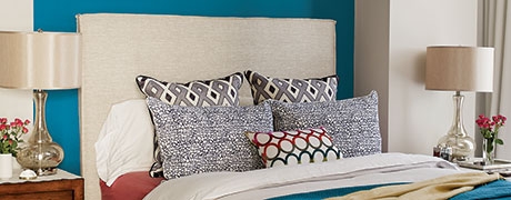
Co-leidoscope loves the spice of life, luxury of global travel and taste of the exotic. Complex patterns, ornate detailing and fine materials captivate these customers. Embellished, eccentric mosaics, dazzling, laser-cut leathers, and colorful metallics and metals offer new, glamorous twists on classics. The color palette features our color of the year, Blue Paisley, paired with faded mid-tones inspired by the time-worn hues from once brightly colored mosaics. The trend carries a Spanish influence and is brought to life in colorful metallics present in glamorous technology design, along with exotic exterior and interior woodwork and richly pigmented glass.
Trend 4: IntroSense
A theme that introduces a new direction in minimalistic styling, blending clean, pared-down designs with quiet nature
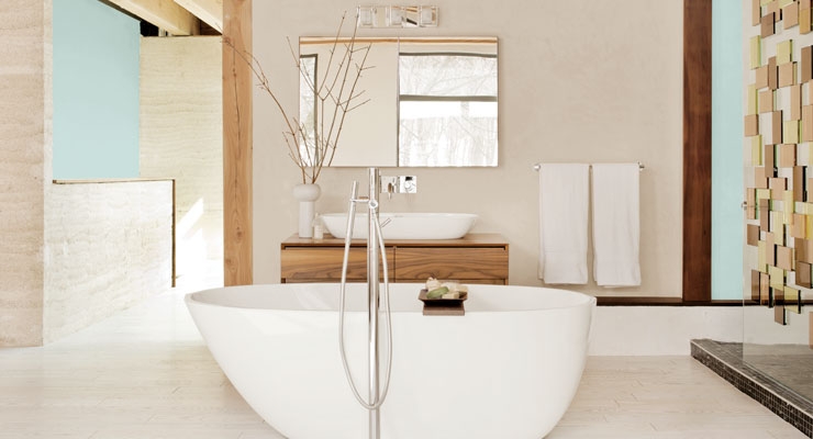
The IntroSense consumer is soulful and values privacy, quality and peace. The IntroSense connection to nature is dry, discreet and non-living, like driftwood, stone and bark. These elements are calming, quiet and muffled. The color palette includes a nuanced neutral with a subtle hint of blue-green paired with muffled off-whites and grays, and then anchored by a silent black. This minimalist trend comes to life in rounded, discreet technological designs and quiet, calming automotive interiors.
Armed with the right tools and the latest knowledge of the 2015 color trends, it’s easier to guide consumers in the right direction for their color tastes. For more tips and tools on color trends and applications, visit www.ppgvoiceofcolor.com.
Dee Schlotter is the Senior Color Marketing Manager for PPG Architectural Coatings and can be reached at schlotter@ppg.com.
The answer is quite simple: everywhere.
Inspiration for color trends can come from a combination of elements found in nature, technology, fashion, media, consumer preferences and more. Color selections are also strongly impacted by the current – and projected – global economic climate.
Often, an even more prominent question among professionals is: How do color trends impact my business goals?
The answer to this question has several facets to consider.
Color provides avenues for individual expression and creativity, while also being a profound business vehicle. Color psychology, or the meaning and feeling associated with a specific color, is proven to have a significant impact on consumer purchase decisions. In fact, research from The Journal of Genetic Psychology has shown that color is such a powerful marketing tool that it accounts for 85 percent of the reason someone decides to purchase a product.
Armed with the right information, tools and technology on the latest color trends, coatings professionals can more easily educate customers and direct them to the paint selections that fit their tastes – ultimately to help increase sales and overall customer satisfaction.
Think Outside the Paint Can
Recognizing that color has strong emotional and cultural connections — as well as varying uses — it is important to consider multiple factors when researching and identifying a global color palette. For the color forecasters at PPG, there is a true artistic process to setting the tone for its annual color trends.
Each year, a network of 23 international color experts organize a three-day Global Color Meeting to analyze design trends, consumer preferences and priorities across regional, cultural and global markets to determine factors that will influence future color choices. Color styles from multiple industries are considered, including automotive, architectural, aerospace and consumer products markets.
Day One consists of group sharing where each expert presents twelve months of preparation, mood boards, magazine cutouts and Pinterest boards for inspiration. Their color ideas are all based heavily on cultural and demographic trends from their region and markets.
Day Two involves identification of common themes across all markets and influences. Color themes chosen are also reflective of cultural changes and sociological shifts that have a global impact.
Day Three is reserved for final color trend selection and refinement. The color stylists collaborate to define the overarching idea behind each color trend palette, but nothing is more hotly debated than the Color of the Year.
2015 Color Trends and Applications
Four global color trends from PPG encompass a wide array of palettes and moods for 2015. Moreover, these color trends aren’t limited just to the home because the hues that consumers love aren’t limited only to the home either — color surrounds every facet of their daily lives.
The following four color trends are part of THE VOICE OF COLOR Program, an industry-leading color system with innovative tools and comprehensive support. It’s a design system based on the premise that every color has an emotional association and that individuals are drawn to different colors for reasons inherently tied to their unique personalities. The program is the color platform for the PPG PAINTS, PPG PITTSBURGH PAINTS and PPG PORTER PAINTS brands.
Trend 1: Good Life
A theme that puts the simplicity of living, harmony and nature at the forefront. Good Life uncovers the maximum possible harmony between the man-made and the natural environment. By emphasizing an earthen spirit and a respect for simplicity, these consumers are often drawn to items that are suggestive of “roughing it.” Good Life is abundant in materials that have a natural quality and rough look, like reclaimed wood, gently pummeled leather and braided wicker. The color palette includes earthy naturals, like soil- and rust-colored browns, quiet whites and softened, clay-colored pinks. The trend comes to life in exterior woodwork and metals with rusted finishes, and interior design styles that favor hand-crafted looks.
Trend 2: I’m Pulse
A theme that fits a social, gregarious consumer group happy to play creative director of their total life experience. I’m Pulse emphasizes the individual consumer who is taking control of design output through the digital space to create what they want, when they want it and how they want it. The personality is plugged in, social and connected and has grown up with a spirit of teamwork and togetherness. The color palette is vibrant and playful. It’s a mix of urban neutrals, like grays and whites, with single bright colors that seem to glow from within. The trend is magnified in artful studios and bright, minimalist industrial work, along with interactive technology and customizable automotive interiors and exteriors.
Trend 3: Co-leidoscope
A theme that encompasses the convergence of cultures, ethnicities, traditions and styles into unique and eclectic designs
Co-leidoscope loves the spice of life, luxury of global travel and taste of the exotic. Complex patterns, ornate detailing and fine materials captivate these customers. Embellished, eccentric mosaics, dazzling, laser-cut leathers, and colorful metallics and metals offer new, glamorous twists on classics. The color palette features our color of the year, Blue Paisley, paired with faded mid-tones inspired by the time-worn hues from once brightly colored mosaics. The trend carries a Spanish influence and is brought to life in colorful metallics present in glamorous technology design, along with exotic exterior and interior woodwork and richly pigmented glass.
Trend 4: IntroSense
A theme that introduces a new direction in minimalistic styling, blending clean, pared-down designs with quiet nature
The IntroSense consumer is soulful and values privacy, quality and peace. The IntroSense connection to nature is dry, discreet and non-living, like driftwood, stone and bark. These elements are calming, quiet and muffled. The color palette includes a nuanced neutral with a subtle hint of blue-green paired with muffled off-whites and grays, and then anchored by a silent black. This minimalist trend comes to life in rounded, discreet technological designs and quiet, calming automotive interiors.
Armed with the right tools and the latest knowledge of the 2015 color trends, it’s easier to guide consumers in the right direction for their color tastes. For more tips and tools on color trends and applications, visit www.ppgvoiceofcolor.com.
Dee Schlotter is the Senior Color Marketing Manager for PPG Architectural Coatings and can be reached at schlotter@ppg.com.
