David Savastano, Contributing Editor03.04.24
Each year, many of the leading architectural paint and coatings manufacturers select their colors of the year. Many factors go into these choices, ranging from fashion trends and surveys to a general feeling about how everyday life is going. For example, during the COVID pandemic, warm, natural and muted colors were the predominant selection for most every paint company.
In speaking with color experts from many architectural paint specialists, there are a wide range of colors that are catching the eye of consumers. Blues were very much in this year, followed by green and tans. Here are this year’s colors from these companies:
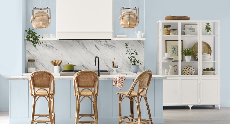
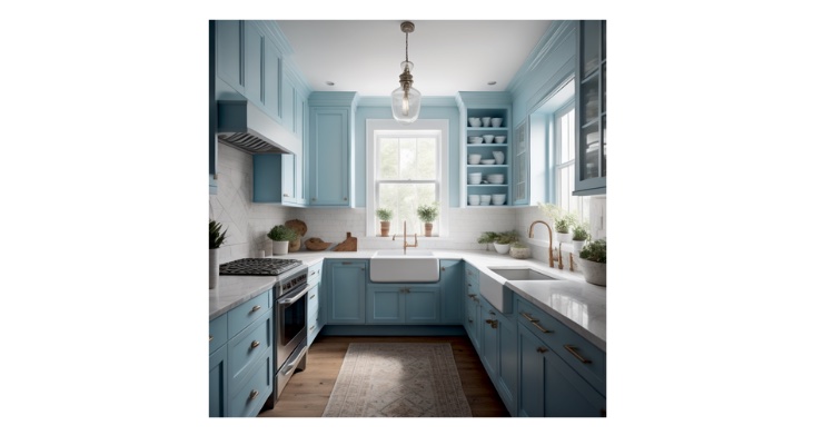
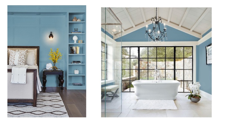
• For Sherwin-Williams, Upward, a light blue with a touch of grey, made for the ideal choice this year. Sue Wadden, director of color marketing, Sherwin-Williams, says that Upward is a “really peaceful color.”
“Upward SW 6239 is a light and airy blue with a little bit of grey, a little bit of lightness and a touch of periwinkle that makes it ethereal,” added Wadden. “It is a really peaceful color that evokes happiness and positivity, creating a calm environment in any room homeowners choose to apply it to. I think it can work well both inside and outside of the home.”
While Sherwin-Williams’ paints are well known in the home market, the company is a leader in more coating segments, most notably aerospace, and Upward fits in nicely there.
“Even though we’re talking about Upward SW 6239 mostly in the home interior space, I can see it in commercial spaces as well, especially aerospace,” Wadden said. “The color has an almost silver iridescence that would be applicable there and in other technological spaces.”
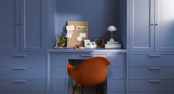
• Benjamin Moore selected Blue Nova 825, a blend of blue and violet, as Color of the Year 2024.
“Blue Nova is an intriguing blend of blue and violet that sparks adventure, elevates the everyday and expands horizons,” Hannah Yeo, color marketing and development manager at Benjamin Moore, noted. “An alluring mid-tone balances depth and intrigue with classic appeal and reassurance, Blue Nova is a great fit for use in a study or home office. Moreover, the hue is flexible enough to be an excellent color choice for a bedroom, living room, ceiling, or even cabinetry.
“Blue Nova 825 offers an opportunity to be creative, whether it is used to color drench a room or define a portion of it, in a way that is approachable for consumers,” Yeo added.
• Skipping Stones, Dunn-Edwards’ 2024 Color of the Year, can be described as a serene and steely blue with hints of green and grey. Skipping Stones is part of Dunn-Edwards’ New Dawn color palette.
“Skipping Stones feels like a daydream and can add a sense of mystery and thoughtfulness to any space,” said DeMing Carpenter, color expert at Dunn Edwards, in announcing the selection. “It’s part of the resurgence of blue and represents a shift away from the bold, warm-toned colors we’ve seen gain popularity over the past few years. This blue is timeless and versatile, fresh and serene.”
“New Dawn is all about finding tranquility in the midst of our hyper-connected, fast-paced world,” Sara McLean, color expert + stylist at Dunn-Edwards, said. “The colors are soft and earthy, creating spaces where you can have a quiet moment. The decor is clean and minimal, yet a touch of nature’s asymmetry adds this sense of peaceful balance.”
• C2 Paint chose Thermal, a sky blue, as its 2024 Color of the Year.
“Thermal is that intense, uplifting summer sky blue, or the vast blue skies of New Mexico in the dead of winter with snow on the ground,” said Philippa Radon, interior designer and C2 paint color specialist. “In terms of transitioning this color into your home with the best results: ceilings, cabinetry, laundry space or pantry, children’s spaces, meditative areas - we like to think of the mood and spirit of the room - the intention and desired ‘feel’ behind a color choice, knowing that first works best and is a steadfast guide.”
Radon said that C2 Paint’s team of color experts observed that there is a sense of individualism this year that is leading to people making personal choices.
“Over the past year, one of the most valuable key trend directions we observed is the individual freedom of style and that this is not a trend but an embodied lifestyle and personal choice,” Radon said.
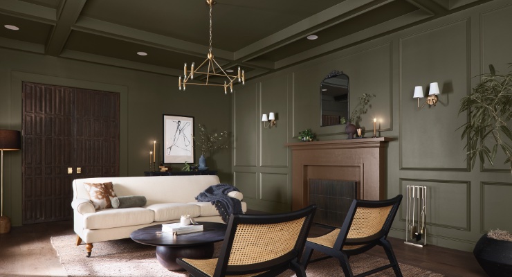
• Dutch Boy opted for a deep olive shade with Ironside as its 2024 One-Coat Color of the Year. Ashley Banbury, NCIDQ and color marketing manager, Dutch Boy Paints, observed that Ironside imparts a sense of comfort to homeowners.
“We see the need for comfort in a home; comfort has evolved – bringing shades into the home that make you feel wrapped in a blanket has grown in popularity,” Banbury said. “As there is a new appreciation for dark shades in the home, Ironside is a perfect shade that creates a cocooning environment but sets the perfect backdrop to layer shades giving you visual comfort in a space.
“Having a connection to nature is an important trend that is going to continue in our home,” added Banbury. “For color, the green undertone of Ironside has the calming elements that we seek from natural shades – designing a space to promote positive wellness.”
• Stainmaster Paint, Lowe’s exclusive paint brand, selected English Green, a nature-inspired tone, as its inaugural Color of the Year.
“Lowe’s and STAINMASTER are giving customers the insight, inspiration and confidence to refresh their homes in the new year with English Green,” said Monica Reese, Lowe’s director of private brands style, in announcing the choice. “In addition to offering an array of on-trend colors, STAINMASTER paint has a great washability in the matte sheen finish, making it both fashionable and functional for life’s toughest messes.”
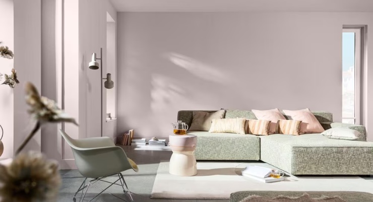
• AkzoNobel chose Sweet Embrace, a pastel pink shade, as its Color of the Year 2024.
“With society in a state of flux, we’re reassessing how we cope with the world,” said Heleen van Gent, creative director of AkzoNobel’s Global Aesthetic Center, in announcing the choice. “Starting at home, we’re looking to create our own ‘special somewhere’ that grounds us in our individual memories and relationships. Our Color of the Year, Sweet Embrace, and its three complementary color palettes can help us achieve that.”
• Cracked Pepper, a soft black, is Behr Paint’s 2024 Color of the Year. Cracked Pepper complements existing colors, materials, and finishes in commercial and residential spaces.
“Cracked Pepper is a versatile black that elevates any indoor or outdoor space,” said Erika Woelfel, VP of color & creative services at Behr Paint Company. “This infinite hue also has the power to shift an ambiance with subtle changes of light throughout the day—from igniting energy to tranquil and meditative. For a bold statement, you can wrap your walls in Cracked Pepper or add an accent for a hint of sophistication.”
• For its 2024 Color of the Year, PPG and its paint families, including Glidden, chose Limitless, a fresh warm honey beige hue that holds both the power of a primary color and the essence of a neutral.
Kat DiBenedetto, PPG global color expert, said Limitless is a perfect fit for how our world is moving to limitless possibilities, adding that 2024’s overarching theme is that consumers are doing what makes them happy unapologetically.
“Limitless is like a ray of sunshine, and is a perfect warmer neutral, an energizing take that can be used in unconventional ways, whether it is for interiors and exteriors or even accents such as ceilings and cabinets,” said DiBenedetto. “It is a fresh warm hue, strong enough to stand on the walls as well as be a highlight. Limitless is also ideal for commercial environments, healthcare, hospitality and extends beautifully to exteriors. You will be seeing it everywhere, even pillows and blankets, transportation and aerospace interiors.”
• Warmth remains a highly desired feeling, and Miller Paint’s choice of Mushroom R012, an earthy warm white neutral, fits that sensibility.
“Mushroom R012 takes its cue from the surrounding forests in our region,” said Puji Sherer, VP of marketing, color & brand at Miller Paint. “An integral part of our natural world, mushrooms support the colorful life that grows up from our soil. Our 2024 Color of the Year mimics nature and is a beautiful backdrop for our home spaces. By choosing the warm white Mushroom for our Color of the Year, we are elevating a hue that can fit easily into any architectural or
design style.” CW
In speaking with color experts from many architectural paint specialists, there are a wide range of colors that are catching the eye of consumers. Blues were very much in this year, followed by green and tans. Here are this year’s colors from these companies:
• For Sherwin-Williams, Upward, a light blue with a touch of grey, made for the ideal choice this year. Sue Wadden, director of color marketing, Sherwin-Williams, says that Upward is a “really peaceful color.”
“Upward SW 6239 is a light and airy blue with a little bit of grey, a little bit of lightness and a touch of periwinkle that makes it ethereal,” added Wadden. “It is a really peaceful color that evokes happiness and positivity, creating a calm environment in any room homeowners choose to apply it to. I think it can work well both inside and outside of the home.”
While Sherwin-Williams’ paints are well known in the home market, the company is a leader in more coating segments, most notably aerospace, and Upward fits in nicely there.
“Even though we’re talking about Upward SW 6239 mostly in the home interior space, I can see it in commercial spaces as well, especially aerospace,” Wadden said. “The color has an almost silver iridescence that would be applicable there and in other technological spaces.”
• Benjamin Moore selected Blue Nova 825, a blend of blue and violet, as Color of the Year 2024.
“Blue Nova is an intriguing blend of blue and violet that sparks adventure, elevates the everyday and expands horizons,” Hannah Yeo, color marketing and development manager at Benjamin Moore, noted. “An alluring mid-tone balances depth and intrigue with classic appeal and reassurance, Blue Nova is a great fit for use in a study or home office. Moreover, the hue is flexible enough to be an excellent color choice for a bedroom, living room, ceiling, or even cabinetry.
“Blue Nova 825 offers an opportunity to be creative, whether it is used to color drench a room or define a portion of it, in a way that is approachable for consumers,” Yeo added.
• Skipping Stones, Dunn-Edwards’ 2024 Color of the Year, can be described as a serene and steely blue with hints of green and grey. Skipping Stones is part of Dunn-Edwards’ New Dawn color palette.
“Skipping Stones feels like a daydream and can add a sense of mystery and thoughtfulness to any space,” said DeMing Carpenter, color expert at Dunn Edwards, in announcing the selection. “It’s part of the resurgence of blue and represents a shift away from the bold, warm-toned colors we’ve seen gain popularity over the past few years. This blue is timeless and versatile, fresh and serene.”
“New Dawn is all about finding tranquility in the midst of our hyper-connected, fast-paced world,” Sara McLean, color expert + stylist at Dunn-Edwards, said. “The colors are soft and earthy, creating spaces where you can have a quiet moment. The decor is clean and minimal, yet a touch of nature’s asymmetry adds this sense of peaceful balance.”
• C2 Paint chose Thermal, a sky blue, as its 2024 Color of the Year.
“Thermal is that intense, uplifting summer sky blue, or the vast blue skies of New Mexico in the dead of winter with snow on the ground,” said Philippa Radon, interior designer and C2 paint color specialist. “In terms of transitioning this color into your home with the best results: ceilings, cabinetry, laundry space or pantry, children’s spaces, meditative areas - we like to think of the mood and spirit of the room - the intention and desired ‘feel’ behind a color choice, knowing that first works best and is a steadfast guide.”
Radon said that C2 Paint’s team of color experts observed that there is a sense of individualism this year that is leading to people making personal choices.
“Over the past year, one of the most valuable key trend directions we observed is the individual freedom of style and that this is not a trend but an embodied lifestyle and personal choice,” Radon said.
• Dutch Boy opted for a deep olive shade with Ironside as its 2024 One-Coat Color of the Year. Ashley Banbury, NCIDQ and color marketing manager, Dutch Boy Paints, observed that Ironside imparts a sense of comfort to homeowners.
“We see the need for comfort in a home; comfort has evolved – bringing shades into the home that make you feel wrapped in a blanket has grown in popularity,” Banbury said. “As there is a new appreciation for dark shades in the home, Ironside is a perfect shade that creates a cocooning environment but sets the perfect backdrop to layer shades giving you visual comfort in a space.
“Having a connection to nature is an important trend that is going to continue in our home,” added Banbury. “For color, the green undertone of Ironside has the calming elements that we seek from natural shades – designing a space to promote positive wellness.”
• Stainmaster Paint, Lowe’s exclusive paint brand, selected English Green, a nature-inspired tone, as its inaugural Color of the Year.
“Lowe’s and STAINMASTER are giving customers the insight, inspiration and confidence to refresh their homes in the new year with English Green,” said Monica Reese, Lowe’s director of private brands style, in announcing the choice. “In addition to offering an array of on-trend colors, STAINMASTER paint has a great washability in the matte sheen finish, making it both fashionable and functional for life’s toughest messes.”
• AkzoNobel chose Sweet Embrace, a pastel pink shade, as its Color of the Year 2024.
“With society in a state of flux, we’re reassessing how we cope with the world,” said Heleen van Gent, creative director of AkzoNobel’s Global Aesthetic Center, in announcing the choice. “Starting at home, we’re looking to create our own ‘special somewhere’ that grounds us in our individual memories and relationships. Our Color of the Year, Sweet Embrace, and its three complementary color palettes can help us achieve that.”
• Cracked Pepper, a soft black, is Behr Paint’s 2024 Color of the Year. Cracked Pepper complements existing colors, materials, and finishes in commercial and residential spaces.
“Cracked Pepper is a versatile black that elevates any indoor or outdoor space,” said Erika Woelfel, VP of color & creative services at Behr Paint Company. “This infinite hue also has the power to shift an ambiance with subtle changes of light throughout the day—from igniting energy to tranquil and meditative. For a bold statement, you can wrap your walls in Cracked Pepper or add an accent for a hint of sophistication.”
• For its 2024 Color of the Year, PPG and its paint families, including Glidden, chose Limitless, a fresh warm honey beige hue that holds both the power of a primary color and the essence of a neutral.
Kat DiBenedetto, PPG global color expert, said Limitless is a perfect fit for how our world is moving to limitless possibilities, adding that 2024’s overarching theme is that consumers are doing what makes them happy unapologetically.
“Limitless is like a ray of sunshine, and is a perfect warmer neutral, an energizing take that can be used in unconventional ways, whether it is for interiors and exteriors or even accents such as ceilings and cabinets,” said DiBenedetto. “It is a fresh warm hue, strong enough to stand on the walls as well as be a highlight. Limitless is also ideal for commercial environments, healthcare, hospitality and extends beautifully to exteriors. You will be seeing it everywhere, even pillows and blankets, transportation and aerospace interiors.”
• Warmth remains a highly desired feeling, and Miller Paint’s choice of Mushroom R012, an earthy warm white neutral, fits that sensibility.
“Mushroom R012 takes its cue from the surrounding forests in our region,” said Puji Sherer, VP of marketing, color & brand at Miller Paint. “An integral part of our natural world, mushrooms support the colorful life that grows up from our soil. Our 2024 Color of the Year mimics nature and is a beautiful backdrop for our home spaces. By choosing the warm white Mushroom for our Color of the Year, we are elevating a hue that can fit easily into any architectural or
design style.” CW
