David Savastano, Editor11.29.22
People look for different things when choosing color, but after the last few years, a sense of warmth is perhaps the most common selection.
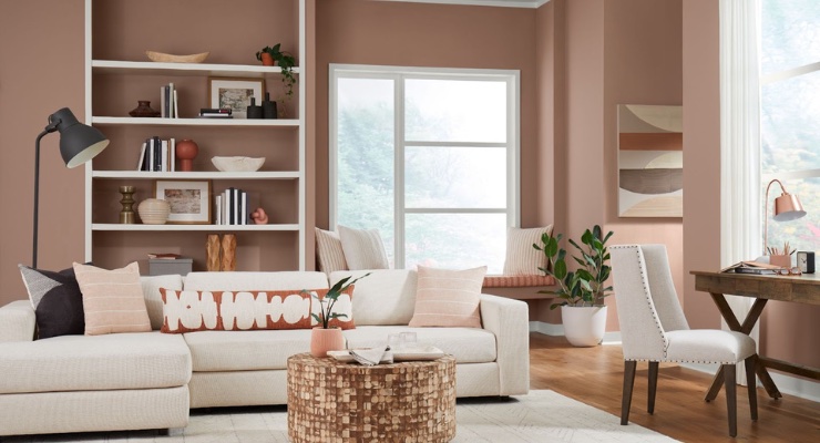
For Sherwin-Williams' global color forecast team, the selection of Redend Point SW 9081 as its 2023 Color for the Year was a perfect choice.
“Warmth and empathy emerged as two central themes for 2023 and Redend Point SW 9081 was the perfect representation of these ideas,” said Sue Wadden, director of color marketing at Sherwin-Williams. “This soulful hue features subtle pink undertones that exude feelings of warmth and exploration, and the color also leans into the macro trends we’ve been seeing around empathy and care culture. While self-care is critical, it’s equally important for us to look out for each other and our communities. This sentiment will carry us through 2023 and beyond.”
Wadden observed that Redend Point SW 9081 is versatile, as it can be used throhghout one’s home.
“Redend Point SW 9081 is a beautiful blush-beige hue that invites compassion and connection into any space,” Wadden said. “It’s an incredibly versatile color that looks beautiful when applied to a variety of areas and environments within the home.
“For example, because of the warmth it exudes, Redend Point SW 9081 makes a beautiful addition to an entryway or in social areas like a dining or living room,” she noted. “It’s also a cosmetic tone, meaning it’s a lovely addition to a bathroom or bedroom – anywhere you practice self-care. The hue also provides a gorgeous accent color when applied to a furniture item like a console or small tabletop accessory like the base of a lamp.”
Wadden said that the process of selecting the Color of the Year starts early and requires lots of information gathering and planning.
“Each year, our global color forecast team researches and identifies cultural trends that are influencing the way the world interacts with color,” Wadden noted. “From that research, we identify the strongest themes that will define the year ahead and these themes are what ultimately inform our Color of the Year selection.
“Our process begins far in advance and with enough time to really analyze and assess the cultural landscape,” Wadden added. “Our team gets together every year and hashes out the trends we’re forecasting for the months ahead with lots of research and immersion. At the end of the process, we come out with our annual Colormix Forecast, which includes the hue that will be the Color of the Year. We do this every year, so it’s a constant evolution.”
To that point, Renend Point is a natural follow-up to last year’s choice, Evergreen Fog. Wadden noted that each year has its own value proposition.
“Directionally, empathy and care culture are two themes defining where we are and how we’re living today,” she said. “After Evergreen Fog last year, it’s been interesting to see neutrals evolve beyond their conventional definition. We’ve been talking about neutrals warming up for almost two years as grays go away. Neutrals are growing up and we’re paying attention. 2023 is all about feeling good, taking care of ourselves, each other, and our communities.”
In a new twist, Sherwin-Williams partnered with Etsy this year, curating a selection of complementary home décor items as well as art and accessories from Etsy sellers.
“I love our collaboration with Etsy this year,” Wadden said. “It was such a fun way to bring Redend Point SW 9081 to life in other ways throughout the home. From stoneware vases to hand-poured candles and custom-made wood furniture, every item from Sherwin-Williams x Etsy was intentionally chosen to represent the hue directly or thematically through grounding neutrals and peaceful warm tones.”
Along those lines, Wadden pointed out that the trends in neutrals have been changing from cool grays to warmer whites, and Redend Pint is a great fit with that.
“I hope Redend Point SW 9081 inspires people to explore neutral colors in new ways,” Wadden concluded. “A neutral hue doesn’t need to be white or gray; it can have a subtle colorful undertone and still serve as a backdrop to not only complement but enhance other hues and design elements within a space. Redend Point is a beautiful color and I can’t wait to see how consumers play with it and style their spaces.”
